










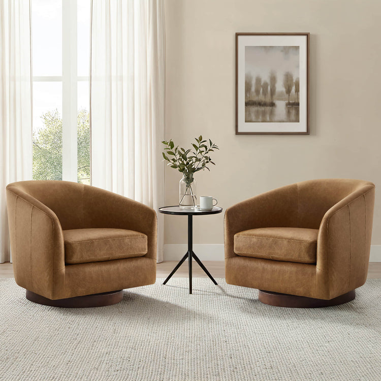
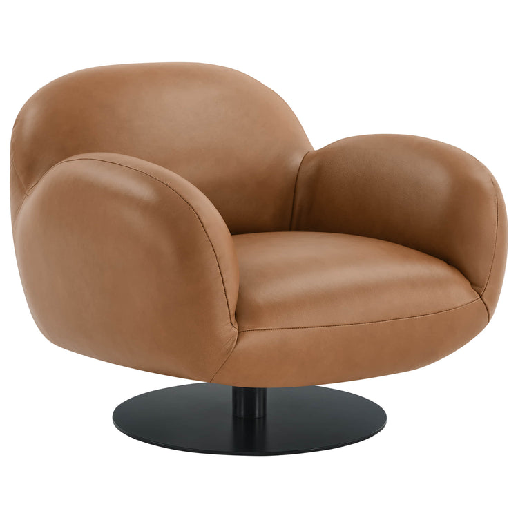
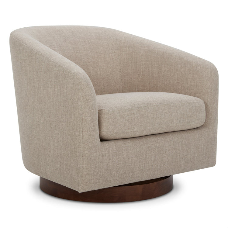

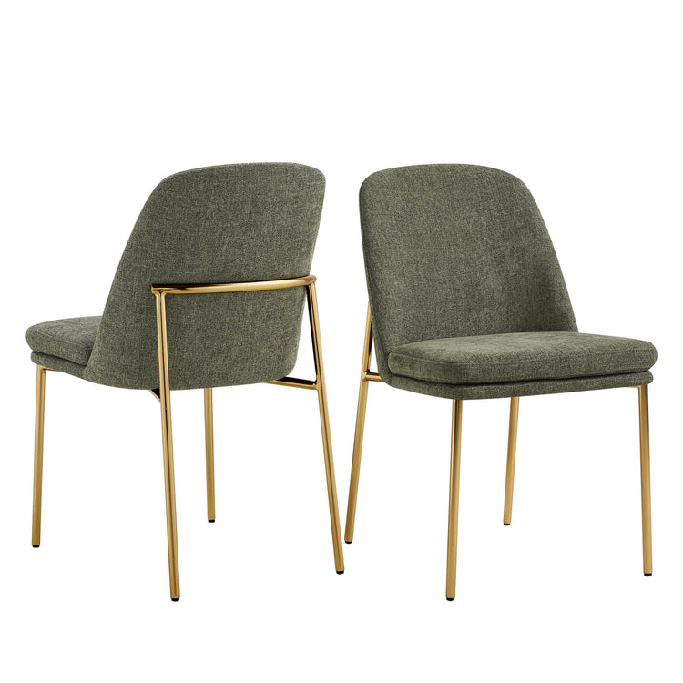











Start with your quartz, not the stool photo. Look at its background color and how much veining it shows, then pick one wood relationship, one visual weight, and one metal strategy so the pieces work together instead of competing. That single decision keeps warm wood, a curved back, textured bouclé, and a metal footrest from all fighting for attention on the same island.
Once you know the undertone and pattern strength, the rest of the choice gets easier: cabinetry and flooring tell you whether to blend or contrast, and bouclé or metal becomes the connector that ties the stool to the rest of the room.
The Fastest Way to Pair Mid-Century Modern Bar Stools With Quartz
The fastest path is a four-step method that turns your existing finishes into one clear stool direction, not a shortlist of products.
- Read the quartz first. Note whether the background leans warm or cool and whether the veining is subtle or bold. A quiet, low-movement quartz can carry more stool texture; a busy, high-movement quartz needs a calmer seat.
- Set the wood relationship. Decide if the stool frame should echo your cabinetry and flooring tone or intentionally contrast with it. You don't need an exact match, just a deliberate relationship.
- Choose silhouette and bouclé intensity together. A curved back and a heavily textured seat are both visual weight. Use one as the focal feature and keep the other simpler.
- Repeat or simplify the metal. Either echo a visible hardware or lighting finish, mix two metals with a clear reason, or let the footrest stay quiet.
The output is a direction, such as "warm wood frame, quieter bouclé, brass repeated from the pendant lights," that you can then check against real samples before shopping for a specific stool.
Use Silhouette and Visual Weight to Set the Mid-Century Mood
A stool's silhouette carries as much visual weight as its color, so decide early whether the island needs a bolder shape or a quieter one.
When a Curved Back Earns Its Visual Weight
Choose a curved, more substantial back when the island or the room around it needs a softened, sculptural counterpoint. This works well against a heavy island base, dark lower cabinets, or a plain quartz slab that has little movement of its own. Because a curved silhouette already reads as a strong shape, keep the upholstery color relatively quiet so the stool doesn't compete with itself.
When to Keep the Profile Lighter
Pick a lighter, more open frame when the quartz already carries bold veining, the island is compact, or the kitchen is visually busy with cabinetry detail and hardware. A simpler profile preserves sightlines in an open-plan layout, which matters if the island is visible from the living or dining area. Visual lightness is a style choice, not a size guarantee, so still confirm the stool's listed width and depth separately before you order.

Match Stool Wood Tones to Cabinetry, Flooring, and Quartz
Wood is the main mid-century bridge between the stool and the rest of the kitchen, and it works through undertone, grain, and contrast rather than an exact color match.
Choose the Undertone Relationship
Warm cabinetry paired with cool white or gray quartz can be connected with a warm-toned wood stool frame, as long as the upholstery stays restrained so the warmth doesn't feel overdone. Dark or painted cabinetry gives you two directions: a lighter wood frame for clear contrast, or a dark frame when nearby furniture or flooring already leans dark. If the quartz has a strong vein color, pull that color into a small accent, such as a piping detail or a metal finish, rather than trying to match the whole stool to it.
Use Grain and Flooring as Tie-Breakers
Visible wood grain adds warmth and an organic feel, but it can compete with a quartz surface that already has strong movement. When the countertop is busy, a quieter, less grainy wood tone keeps the seating from adding another layer of pattern. In an open-plan kitchen, compare the stool frame with the nearest dining table or a floor lamp base if those pieces are more visually dominant than the island itself; that comparison, not the cabinetry alone, may be the real tie-breaker.
Use Bouclé as Texture, Not Competition
Bouclé's job is to add tactile softness, and whether it should be bold or quiet depends on how much pattern the quartz already carries.
Let Pattern Strength Set the Texture Level
Strong quartz veining generally calls for simpler stool lines and less contrast in the seat color, so the countertop stays the visual anchor. A quieter, more uniform quartz surface can carry a more tactile bouclé seat, since the stool becomes the main source of softness in the room. Compare an actual quartz sample with a bouclé swatch side by side rather than matching by color name, since "ivory" or "oat" can look different across manufacturers.
Separate Visual Softness From Performance
Visual texture and functional performance are two different checks. Confirm the exact upholstery composition and any listed care instructions on the current product page instead of assuming every bouclé behaves the same way. A term like water-resistant describes a specific fabric treatment, not a universal guarantee against stains, wear, or pet damage, so treat it as one data point rather than proof of durability. If the kitchen already has several textures at play, a flatter, non-bouclé upholstery can be the better choice simply because it adds less visual noise.
Choose a Metal Accent Strategy for the Island
The stool's metal footrest or frame can repeat your island hardware, mix with it on purpose, or step back and let wood and quartz carry the contrast.
Three Ways to Handle the Metal
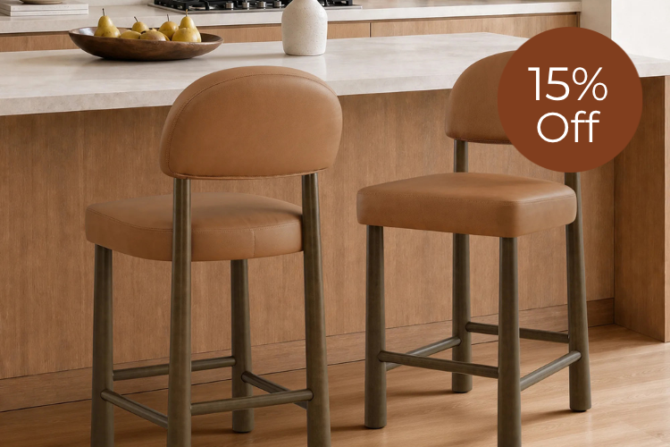
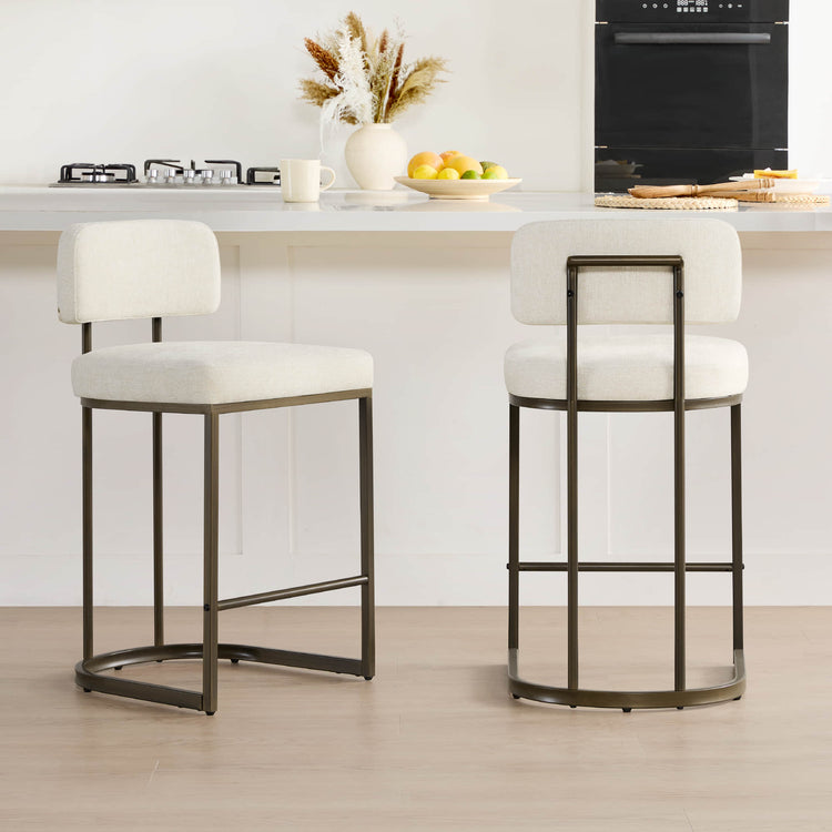
Coordinate the stool's metal with cabinet pulls, a faucet, or pendant lighting when that hardware already reads as a clear anchor in the kitchen; just watch that a polished finish doesn't turn into a second shiny focal point next to the countertop. Mix metals intentionally when the room already uses more than one finish in different roles, such as brushed nickel on the faucet and brass on the lighting, so the stool has a logical place to land. Minimize the metal altogether when the wood frame and quartz already supply enough visual contrast; in that case, let the footrest or base recede in a low-key black or matte finish. For a mid-century stool that leans on woven texture and a warm metal frame instead of visible wood legs, the Jade curved counter stool is a practical reference point, with a listed 27-inch seat height to check against your counter.
Check Sheen as Well as Color
Sheen changes how prominent a metal reads, independent of its nominal color. A polished or high-shine finish reflects more light and draws the eye, while a matte or satin finish sits back and feels understated, according to countertop-maker planning guidance on refining finishes. Compare the stool's actual finish against your hardware and lighting under the kitchen's real daylight and evening light, not just a product photo, since gold, brass, black, and bronze can each mean several different sheens depending on the manufacturer.
Choose the Right Stool Direction for Your Kitchen
Applying the wood, silhouette, bouclé, and metal decisions to your actual kitchen produces one of four common directions.
| Kitchen scenario | Stool direction | Emphasize / quiet |
|---|---|---|
| Warm cabinetry, cool quartz | Warm wood frame, restrained upholstery | Emphasize the wood bridge; quiet the metal and pattern |
| Dark or painted cabinetry | Lighter wood for contrast, or dark frame if room supports it | Emphasize the intended contrast level; quiet extra competing tones |
| Strongly veined quartz | Simpler silhouette, quieter bouclé color | Emphasize a single pulled vein accent; quiet bold texture |
| Minimal or open-plan kitchen | One tactile or metal accent, repeated nearby | Emphasize warmth from bouclé or wood; quiet multiple new finishes at once |
A textured, curved-back option like the Troy boucle counter stools fits the warm-wood or minimalist directions well, since it pairs a solid wood base with soft bouclé and is listed for 35- to 37-inch counters. When dark cabinetry calls for a firmer wood contrast, the Greyson swivel counter stool offers dark-brown birch legs and a curved back with a 360-degree swivel. Neither stool is the universal answer; each simply demonstrates one listed material or silhouette from the table above. Repeating one chosen finish in nearby furniture or lighting also supports the whole-room continuity that current kitchen design research associates with open-plan layouts.
Verify the Stool Before You Buy
Aesthetic fit only matters if the stool actually fits the counter and the facts on the product page match what you expect.
Confirm Physical Fit First
Measure your counter height, the available width per diner, knee depth, and how much room is left for traffic behind a seated guest, rather than judging scale from a photo. At a 36-inch counter, the Kitchen Planning Guidelines call for at least 24 inches of width and 15 inches of knee depth per seated diner, plus 44 inches of clearance where foot traffic passes behind the seating. Use the stool's listed width and depth against those numbers before you decide on quantity or exact seat height.
Confirm the Product Facts That Change the Choice
Check the exact frame material and finish, upholstery composition, cleaning code, overall dimensions, stated weight capacity, warranty, and return window on the current product page, since specification sheets can be updated. Verify the color option you want is still in stock and re-check the listed measurements before ordering, because small variations between a product's own pages can appear over time. Treat any named example in this guide as a starting point rather than proof that it will match every quartz surface.
We compare a quartz or cabinet sample against the shortlisted stool's finish photos and current listing before adding anything to the cart, and we're glad to help if a question about fit or materials comes up during that step.
FAQs
What if my quartz has both warm and cool undertones?
Use the dominant background color to set the broad stool palette, then borrow one restrained color from the veining for a single small accent, such as piping or a metal finish. Adding a third unrelated finish on top of a mixed quartz tends to make the island feel scattered, so keep the extra accent to one element.
How can I compare a stool finish to my quartz when shopping online?
Hold a real quartz or cabinet sample next to the product's finish photos rather than relying on memory or a color name. Product photography and screens can shift color slightly, so treat online images as a close approximation and confirm the final look once a sample or the stool itself arrives.
How do I know whether to choose counter-height or bar-height stools?
Measure the vertical distance from your floor to the top of the island surface. Standard 35- to 37-inch kitchen counters pair with counter-height stools (typically 24 to 27 inches from floor to seat), while 41- to 43-inch raised breakfast bars require taller bar-height stools (usually 28 to 32 inches) to ensure comfortable leg clearance.
Recommended Products

More to Read
 7 Sofa Trends That Actually Improve Comfort in 2026
Upgrade your living room with furniture that supports your body. Here are 7 modern sofa features designed to maximize your daily comfort...
7 Sofa Trends That Actually Improve Comfort in 2026
Upgrade your living room with furniture that supports your body. Here are 7 modern sofa features designed to maximize your daily comfort...
 Mother's Day Gift Guide: Cozy and Stylish Furniture Picks for Modern Moms
Make Mother's Day more meaningful with furniture gifts that bring comfort, smart features, storage, and quiet luxury into her everyday routine.
Mother's Day Gift Guide: Cozy and Stylish Furniture Picks for Modern Moms
Make Mother's Day more meaningful with furniture gifts that bring comfort, smart features, storage, and quiet luxury into her everyday routine.
 Performance Fabric Reality Check: Does It Really Repel Pet Hair and Stains?
Performance fabric is often marketed as a miracle solution for homes with pets and kids, but the reality is more nuanced. It...
Performance Fabric Reality Check: Does It Really Repel Pet Hair and Stains?
Performance fabric is often marketed as a miracle solution for homes with pets and kids, but the reality is more nuanced. It...